Word Travels

Client:
Word Travels, Slam Poetry NFP organisation
Deliverables:
Competitive analysis, heat maps, key interview findings, business model canvas, personas, journey map, site map
My role:
I led the UX research and UI design in a team of 2 on a 3-week sprint, collaborating on design and testing of the prototype. Our designs are currently being developed by Word Travels for their new website release.
Software:
Figma
Miro
Optimalsort
Notion
Project in a nutshell:
A project working in collaboration with the CEO/founder and head of Marketing of Word Travels. The task was to enhance their donorship and user experience.
Walking through the site with board members, donor group, educators, artists and prospective donors, we developed a new website and key insights for Word Travels to move forward with. Let’s take a look at how we got there.
PROJECT OVERVIEW
Problem statement
Users wanting to donate to Word Travels find the process difficult, obtaining information tough and dropping off before donating to the organisation
More issues than just the donation process
-
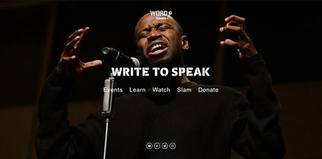
The Landing page doesn't clearly state what the organisation does
-
Events take you to a fundraising site not showing other events
-
Clicking 'slam' takes you to a seperate website and no way of getting back to the Word Travels website

-
Our programs page promotes 'creatives for carers' without any context of what it is
-
Donate button not prevalent enough
-
No information on what Word Travels does and who they are
The plot thickens with initial insights
The site doesn’t tell you instantly what the organisation is about
Separate webpage for the Australian Poetry slam, unclear if it’s run by Word Travels of as a separate organisation
Several versions of what Word Travels actually does throughout site, no clear and consistent message
Donate page has a huge 'Creatives for carers' image, with no details on what it actually is
Some menu options are clickable and others are drop downs
Users gettin' their hands dirty
We wanted to know how users flowed through the website, to see this we gave 7 potential donors two tasks:
-
Find out what Word Travels does/who they are
-
Make a donation and tell us where our donations go
"I expected to see the impact of where my money might be going?"
"Too many options on donation page, I expected a single donate option"
"Why do I still not know what the charity does after landing on the first page?"
"Copy seems inconsistent throughout page"
"This landing page is complicated, why am I taken to areas of website I didn't expect?"
"Creatives for carers is too prominent and not explained what it actually is"
"This education page confusing - not sure what they actually offer"
It's heating up! (heat-map testing)
We wanted to see where users eyes were drawn when entering the site. To do this, we used visual eye tracking software.
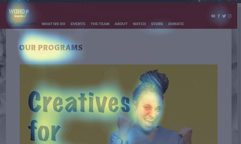
When testing Word Travels site, we found:
-
Donate button not highlighted
-
Creatives for carers is heavily highlighted but not explained what it is
-
Our Programs text is highlighted, not highlighting the work Word Travels does
How the competition fared
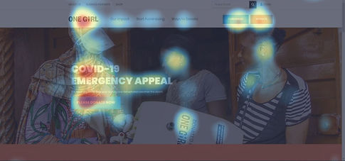
One Girl
-
Call to action clearly promoted, both Donate and Fundraise buttons highlighted
-
COVID-19 emergency appeal prominent
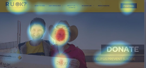
RUOK
-
The 'Find Help' button is clear and prominent
-
Your eyes are drawn to the donate button which clearly states what the NFP does
Word Travels does things....differently
We wanted to know how exactly Word Travels stacks up against other not for profits

Tell us what you really think
To gain an understanding of what users expected from the current site, we interviewed 10 potential donors, 4 of the donor board members, 3 board members, 6 educators and 4 artists. Here are our findings.
Key insights
"I use my laptop when I donate money"
" Word travels donation process is poor and not streamlined"
"I like to see what impact my money is having"
"Negative engagement turns me off donating"
"If I don't trust the charity I don't donate to them"
"Overall copy needs to be clearer, right now it's confusing"
"it's good to hear from the charities that I donate to regularly"
"In-school workshops make a huge impact on students"
"Workshops are too expensive for one class"
Who we built for
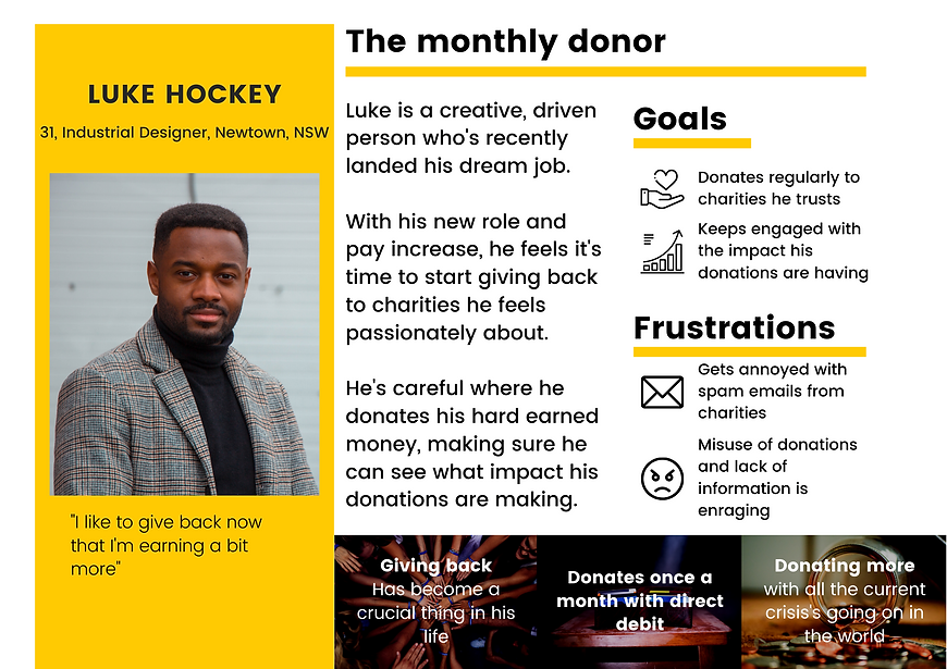
Before you build it, you need to know who you're building for. After synthesising our findings we produced Luke, our monthly donor.
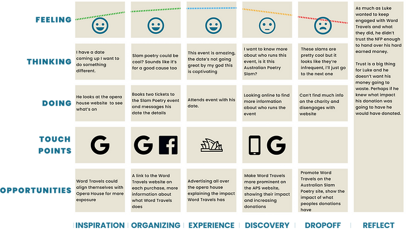
Lukes journey
Now that we know what makes Luke tick, we want to look at how Luke might interact with Word Travels
How we got to our final designs
Card sort
An open card sort showed us the overall headings and structure needed to change
M
S
C
W
MSCW gave us the action steps on what to focus on.
Must:
-
Build a user first website that funnels people to donate
-
Rework or lose landing page
-
Show impact analytics on front page to entice more donations
Should:
-
Highlight the different events more prominently
Could:
-
Strip the APS site and lose double ups with Word Travels website
Won't:
-
Combine both websites
The site map formed the blueprint for how the headings and structure of the site would be laid out
Site map
Things are happening!
Tested each iteration with 4x donors, 3x board members, 4x artists and 7x potential donors
Key testing takeaways:
-
Flows well and things are clear, nothing unexpected
-
Images would help with context
-
No option for videos/see poetry performances
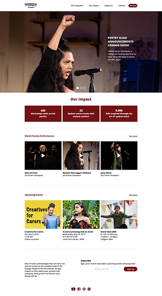
Key takeaways:
-
Landing page a concern, is it really necessary?
-
Imagery is impactful, but more significant to artists
-
Quicker insights needed into impact - stories over stats/needing to click in
-
Donation needs to remain in the same page
The problem with nailing it
Fortunately… or unfortunately depending how you look at it, our designs tested really well from the start. Navigation and flows were clear with hardly anything being unexpected.

Final Design:
-
Imagery has changed to show how diverse Word Travels offerings are
-
Landing page is now the home page
-
Videos now play larger and within the site
-
Donation process now remains on the site, doesn't take you to a seperate page
-
The impact page highlights the amazing work Word Travels does and the impact they've had on people
-
Donation impact is clear and obvious
Quick wins
-
Less options on the landing page, funnel users to the right area
-
Links to a new website opens in new window
-
Word Travels taking more ownership of APS
-
Change navigation group names on dropdown menu - based off card sort and testing
-
Change imagery on Word Travels website to align more with users
Next steps
Being a 3 week sprint, there were some keys areas we would have focused on given more time.
-
Lose the landing page - full screen image achieves the same impact
-
Rework the charities other page 'Australian Poetry Slam' to be more inline with the Word Travels site
-
Make the copy consistent and concise throughout the website, shorter and impactful the better
-
Highlight impact of donations more
-
Testimonials from artists, educators, donors, people love Word Travels so harness that
-
Work on the pain points that came up from the educators, look at the service design and rework the service blueprint
Extra value
On top of our initial deliveries, we ran a card test with 6 of the artists to see how they would group together categories on the Australian Poetry Slam website. The results lead to the below hi-fi mockup of the landing page.
